Stocks Technical Analysis Basics
Technical analysis starts with the graphical representation of stock prices in a chart. Let’s have a look at the different charts and which type provides the most information.
Charts
Although there are many charts, the ones listed below are those used most often, and the candle chart is preferred because it provides the most information.
Line Chart
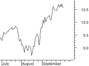
A line chart is not used much anymore. It was the basic chart used prior to the advent of the personal computer. Stock price data was registered manually, and only closing prices were registered.


The line chart was created connecting the closing prices (figure 4.1).
Figure 4.1: Line chart.
Bar Chart
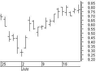
The highest and the lowest prices in the given period (minutes, hours, days, weeks, and months) are connected with a vertical bar.

In figure 4.2, the opening price is represented by the tick mark at the left side; the closing price is represented by the tick mark at the right side.
The bottom and the top of the vertical bar represent the lowest and highest prices of the period, respectively.
The bar chart is used mostly in Western technical analysis.
Figure 4.2: Bar chart
Candle Chart
The candle chart has its roots in the Far East. It is believed that Mr. Homma, a Japanese rice merchant, used candle charts for the first time around the year 1850. Steve Nison introduced the candle chart to the Western world in his book, Japanese Candlestick Charting Techniques.

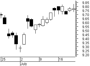
Candle charts clearly depict price development in a trading period. The body of the candle in figure 4.3 represents the move between the opening and closing prices.
If the price closes above the opening price, the candle body is blank (white). If the stock price closes below the opening price, the candle body is filled (black).
Figure 4.3: Candlestick chart.
A candle can be either a body or a body with long or short wicks, called shadows that reach to the highest and lowest prices in the trading period.
The recognition of candle-chart patterns is a study unto itself. We will discuss most of these patterns in chapter six. LOCKIT basically uses candle charts because candle patterns are part of the decision making process and most common used on the daily charts.
Stocks Technical Analysis Basics
Support Lines and Resistance Lines
Support and Resistance at turning points
Prices move in waves. This undulating price picture with tops and bottoms occurs because, at a certain level, the price experiences support or resistance. At a bottom, the price is supported by sufficient buyers, and it bounces up again. At a top, the price is pushed down by large selling pressures.

Figure 4.10: Basic support and resistance.
The price level of a share has everything to do with supply and demand (figure 4.10) forming the resistance lines and support lines. For a given increase in price, there are a number of buyers and sellers. A price increase will attract more sellers, but the number of buyers will decrease. A resistance line forms at a balance in sellers and buyers.

Figure 4.11: Resistance becomes support.
A broken resistance line automatically becomes a support line for future price levels (figure 4.11). Horizontal support lines and resistance lines are drawn through turning points in price or a price window. A confirmation is given if the price turns against this line.
A support or resistance line is broken if crossed with the closing price.
Stocks Technical Analysis Basics
Windows Support and Resistance
We talk about a rising window if the lowest price today is higher than the highest price of yesterday, while a falling window occurs if the highest price today is lower than the lowest price of yesterday.

Figure 4.12: Windows resistance and support levels.
In figure 4.12, look at how windows constitute important support and resistance levels. The entire area of a window represents support or resistance. The support or resistance of a window is broken only if crossed with the closing price.

The height of the window has no importance (figure 4.13).
REMARK: It can be worthwhile to pass on support or resistance from a lower time frame like, for example, an hourly price chart to a chart with daily prices (or visa versa).
A certain support or resistance area is possibly a window in the hourly price chart, but it is not visible on the daily chart.
Figure 4.13: The height of the window is not important.
Confirmation of Support and Resistance
Turning points at a support or resistance level often are confirmed by candlestick reversal patterns.


Figure 4.14: Support and resistance confirmation.
In the chart in figure 4.14, notice the first reversal with a hammer pattern and the next two reversals with engulfing bullish patterns.
Technical Analysis Windows (Gaps)
Windows are part of support and resistance and can be used for initial stops because of the support as well as for price targets because of their resistance. Additionally according to the type of window we can expect to be at a trend reversal, a trend continuation or near a trend conclusion.
An up window in a bar chart appears when the low price of the current bar is higher than the high price of the previous bar. A down window in a bar chart appears when the high price of the current bar is lower than the low price of the previous bar.
We consider four window types: a common window, a breakaway window, a continuation window, and an exhaustion window. A window is closed and support or resistance has no further meaning when the price turns around and completely covers the window.
As long as a window is not closed, the whole area of a window represents support or resistance for future price moves. A breakaway window, a continuation window, and an exhaustion window represent a much more important support or resistance compared to a common window.
The support or resistance of a window is only broken when it is penetrated with the closing price.
Common Windows
A common window is so-called because it is common in the normal price evolution.
Most of the common windows can be found during periods of price consolidation when the price is moving sideways.
Most of the common windows can be found during periods of price consolidation when the price is moving sideways.

Figure 4.71: Common windows.
In figure 4.71, you can see that a common window does not give any indication about an expected price move.
Generally, it only can be used as a support and resistance level for the short term.
On a daily chart, common windows will be closed most of the time within a couple of weeks.
Technical Analysis Windows (Gaps)
Breakaway Windows
A breakaway window will appear with a change in the medium- to longer-term price trend.
Rising Breakaway Window

About three-quarters of the rising breakaway windows (figure 4.72) on a daily chart are closed within a year.
About only 2% will be closed within a week.
Usually the breakaway window is created with high volume or a gradually higher volume with a number of bars before the breakaway.
Figure 4.72: Rising breakaway window.
Falling Breakaway Window

About 60% of the falling breakaway windows (figure 4.73) on a daily chart are closed within a year.
Only about 2% will be closed within a week.
Usually the breakaway window is created with high volume or a gradually higher volume with a number of bars before the breakaway.
Figure 4.73: Falling breakaway window
Technical Analysis Windows (Gaps)
Continuation Windows
A continuation window will be found halfway through a running trend, often after a short consolidation pattern like a flag or a pennant, or a bigger correction pattern like a triangle or a rectangle. Rising Continuation Window

Almost all of the rising continuation windows (figure 4.74) on a daily chart are closed within a year.
Only about 5% will be closed within a week.
Usually the continuation window is created with high volume or a gradually higher volume with a number of bars before the continuation window.
Figure 4.74: Rising continuation window.
Falling Continuation Window

Almost 100% of the falling continuation windows (figure 4.75) on a daily chart are closed within a year.
Only 5% will be closed within a week.
Only 5% will be closed within a week.
Usually the continuation window is created with high volume or a gradually higher volume with a number of bars before the continuation window.
Figure 4.75: Falling continuation window.
Technical Analysis Windows (Gaps)
Exhaustion Window
The exhaustion window can be found near the end of the running trend. Often, you will see a bigger window with highly volatile price moves.
Rising Exhaustion Window

Almost all of the rising exhaustion windows (figure 4.76) on a daily chart are closed within a year.
As many as half of them will be closed within a week.
Usually, the exhaustion window is created with high volume or a gradually higher volume with a number of bars before the exhaustion window.
Figure 4.76: Rising exhaustion window.
Falling Exhaustion Window

Almost all of the falling exhaustion windows (figure 4.77) on a daily chart are closed within a year.
As many as half of them will be closed within a week.
Usually, the exhaustion window is created with high volume or a gradually higher volume with a number of bars before the exhaustion window.
Figure 4.77: Falling exhaustion window.
Breakaway, Continuation, and Exhaustion Windows

Figure 4.78: Breakaway, continuation and exhaustion window.
Most of the time, breakaway, continuation, and exhaustion windows are created with high volume or a gradually higher volume with a number of bars before the breakaway.
Regularly, you will notice chart price patterns before these windows.
Stocks Technical Analysis Basics
Volume
Volume bars are represented mostly as a histogram in a separate window below the price bars. Rising volume with rising or falling prices points to a rising (stock accumulation) or a falling (stock distribution) stock trend, respectively. Falling volume, on the other hand, points in the direction of a price correction.

Figure 4.9: Rising and falling volume.
In the Unilever chart (figure 4.9), we see a rising price level beginning in March with rising volume. This is followed by a price consolidation, confirmed by falling volume. Volume up or downtrend is indicated by linear regression lines over the volume bars.
The price continues its way up, and a new top is reached with up-volume. Falling prices and falling volume in May indicate a correction, an additional price up-move is expected after this correction. The new up-move starts beginning in June and moves up until the beginning of July, with increased volume.
The next move down is not simply a correction, but the start of a new downward move. Prices are now falling with increased volume. The move up in August is a price correction because it has decreasing volume. As a whole, you can now see an up-going trend with corrections from March until the beginning of July, followed by a down-going trend.