Indicators
These days, there are hundreds, and probably thousands, of indicators and oscillators, especially if you count the many indicators that have been developed solely for personal use. We will strictly limit the overview here to indicators used by myself.


Fibonacci Studies
Leonardo Pisano Fibonacci was an Italian mathematician born in 1170. He was considered by some to be, “the most talented mathematician of the Middle Ages”.
In Liber Abaci (c. 1202), Fibonacci introduced the so-called modus Indorum (method of the Indians), which today is known as Hindu-Arabic numerals.
Liber Abaci also presented, and solved, a problem involving the growth of a hypothetical population of rabbits, which was based on idealized assumptions. The solution was a sequence of numbers that, over several generations, became known as Fibonacci numbers.
The number sequence was known to Indian mathematicians as early as the 6th century, but it was Fibonacci’s Liber Abaci that introduced it to the West.
Fibonacci numbers have the following sequence:
1, 1, 2, 3, 5, 8, 13, 21, 34, 55, 89, 144, 233, and so on. Each number is the sum of the two previous numbers. The higher up in the sequence, the closer two consecutive numbers of the sequence divided by each other will approach the golden ratio (approximately 1 : 1.618, or 0.618 : 1).
1, 1, 2, 3, 5, 8, 13, 21, 34, 55, 89, 144, 233, and so on. Each number is the sum of the two previous numbers. The higher up in the sequence, the closer two consecutive numbers of the sequence divided by each other will approach the golden ratio (approximately 1 : 1.618, or 0.618 : 1).
Fibonacci numbers, or patterns, are found in seashells, flower petals, sunflower seed heads, pinecones, palm fronds, pineapple rinds, and 90% of plant leaf and petal arrangements.
Fibonacci Levels
Charting Fibonacci levels is done by first drawing a fictive vertical line between two turning points that you wish to examine for Fibonacci levels.
Next you draw horizontals through retracement levels at 100%, 61.8% (100*0.618), 50%, 38.2% (61.8*0.618), 23.6% (38.2*0.618), and 0%; next horizontals at three or more Fibonacci target levels at 161.8% (100*1.618), 261.8% (161.8*1.618), and 423.6% (261.8*1.618). After the price moves up or down, there often will be a partial retracement, which will find support and resistance on Fibonacci levels.
Fibonacci Levels in an Uptrend
We use the chart of AMR Corp to show Fibonacci levels in an uptrend.

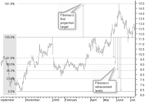
Figure 9.3: Fibonacci levels giving support and resistance to future price movement.
In figure 9.3, creating the Fibonacci levels from a 0% rise until a 100% price up-move between the end of September and December 2004, shows a number of horizontal lines giving support and resistance to future price movement.
By the end of May, previous top levels around $11.70 were broken. The price then continued to move right up to the next Fibonacci level at 161.8%, or $15.
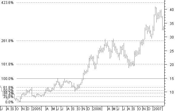
Looking at the same chart with weekly bars in figure 9.4 and a new Fibonacci projection between the start of the up-move in September 2004 until the first reached target at $15 in June 2005, gives new future price targets.

Figure 9.4: New Fibonacci projection targets on weekly chart.
Where do you think price moved to? Believe it or not, right up to Fibonacci levels 161.8%, 261.8%, and very close to 423.6%.
Fibonacci Levels in a Downtrend
We use a chart of AHOLD a Dutch stock to look at Fibonacci levels in a downtrend.

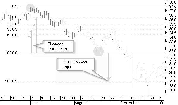
Figure 9.5: Fibonacci retracements and projection levels in a downtrend.
Creating the Fibonacci levels in figure 9.5 from a 0% price drop until a 100% price down between the beginning of July and mid August, shows a number of horizontal Fibonacci retracement levels giving support and resistance to future price movement.
Creating the Fibonacci levels in figure 9.5 from a 0% price drop until a 100% price down between the beginning of July and mid August, shows a number of horizontal Fibonacci retracement levels giving support and resistance to future price movement.
At the beginning of September, a previous bottom at 32.2 was broken. The price then continued to move down until the next Fibonacci level at 161.8%, or 29.0.

Figure 9.6: Fibonacci projection levels reached on weekly downtrend example chart.
Next, have a look on the weekly chart of figure 9.6 to see what other levels have been reached. You find this hard to believe?
Historical Fibonacci Projection
When price changes from for example a downtrend to an uptrend, it is only possible to draw Fibonacci retracement levels for the past downtrend move, using this retracement levels as price targets for the new up move.
It is clear that at the start of a price turning point, there is no second reference point available for a Fibonacci projection; however, since support and resistance levels from the past also are many times continued in the future, it is not unusual that previous support or resistance can be used as the second reference point for a Fibonacci projection into the future.
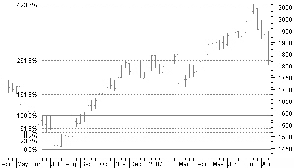
The NASDAQ index in figure 9.7 went down from 1750 to 1450. After the turning point in July, we expect an up-move. For a future price estimation, we created a Fibonacci projection with the reference low point in mid July and the last previous top, which gave a first target at a level of 1680.

Figure 9.7: Fibonacci historical projection principle.

Figure 9.8: Fibonacci historical projection confirmed.
Figure 9.8 shows that not only we reached the target at 1680, but we also reached the Fibonacci projections at 261.8% and 423.6% from the same historical reference point.
Reaching a Fibonacci target level is an important part of the signals used to close a position.
RSI (Relative Strength Index)
The RSI indicator I use as part of the decision process to open or close a position. Divergence signals between price and RSI are a trade confirmation when other buy or sell signals are present. On the other hand, an overbought or oversold RSI can help to hold on to the position when selling signals appear, that way avoiding unnecessary closing of the position.
I use a standard RSI with a dynamic reference level.
The Relative Strength Index (RSI) is a popular momentum oscillator. Momentum refers to the speed of change; oscillator means that the value of the RSI moves (oscillates) between two values (0 and 100). The RSI was introduced by J. Welles Wilder in New Concepts in Technical Trading Systems.
The term “relative strength” might sound a little confusing because it does not compare the relative strength between stocks; rather, it compares the actual price with past prices.
For the application and estimation of price evolution I primarily look at divergences between the RSI and the price bars.
The Formula
 Meaning:U = Averaged sum of the prices when the closing price was higher (compared to the previous bar) in the period used.
D = Averaged sum of the prices when the closing price was lower (compared to the previous bar) in the period used.
Within the time period used, RSI measures the relation between the price bars with a higher closing price compared to the previous bar, and between the bars with a lower closing price compared to the previous price bar.
Originally, Wilder used a 14-day period on daily charts; this remains the standard and most widely used value today.
The RSI is a leading indicator.
Tops and bottoms will be visible in the RSI before they show on the price chart.

Figure 5.1: RSI divergences and overbought and oversold areas.
The standard 14-period RSI makes tops above 70 and is called the overbought area; when it bottoms below 30, it is called the oversold area (figure 5.1).
These tops and bottoms show up in the RSI before there are tops or bottoms visible on the price chart; however, a continuing uptrend or downtrend will keep the RSI in the overbought or oversold zone.
Convergence and Divergence
When tops or bottoms of a stock price and an oscillator move in the same direction it’s known as convergence. When price and oscillator tops or bottoms move in opposite directions, it’s known as a divergence.
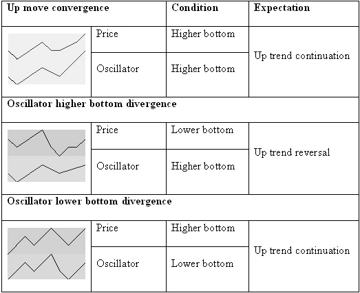
Figure 5.2: Basic bottom convergence and divergence.
In looking at the lows of the oscillator and comparing them with the lows in price, we can define three different situations (see figure 5.2):
- When the price and oscillator make higher or equal bottoms, they converge. Until there is no other indication, the most probable price move is a continuation of the uptrend.
- When the oscillator creates a higher bottom while the price makes a lower bottom, they diverge. This is mostly found at the end of a downtrend, indicating an uptrend reversal.
- When the oscillator has a lower bottom while the price sets a higher bottom, they diverge. This is mostly found in a price uptrend after a price correction, indicating a continuation of the uptrend.
Simply looking at bottoms, we can say that the price is going to move up if there is a divergence between the price and the oscillator or if the price and the oscillator bottoms converge in an uptrend.

Figure 5.3: Basic top convergence and divergence.
Looking at the highs of the oscillator and comparing them with highs in price, we can define three other situations (see Figure 5.3):
- When the price and the oscillator make equal or lower tops, they converge. Until there is no other indication, the most probable price move is a continuation of the downtrend.
- When the oscillator makes a lower top while price makes a higher top, they diverge. This is mostly found at the end of an uptrend, indicating a downtrend reversal.
- When the oscillator makes a higher top while price makes a lower top, they diverge. This is usually found in a price downtrend after a price up correction, indicating a continuation of the downtrend.
Just by looking at the tops, you can say that the price will move down if there is a divergence between the price and the oscillator or if the price and the oscillator tops converge in a downtrend.
Divergences are reliable indications for predicting trend reversals.
A divergence with a higher bottom in the RSI indicator and a lower bottom on the price chart is an indicator for an uptrend reversal . On the other hand, a divergence with a higher top in the price chart and a lower top in the RSI indicator points to a downtrend reversal (figure 5.1).

Figure 5.4: Inverse divergence with a higher top in the RSI and a lower top in price.
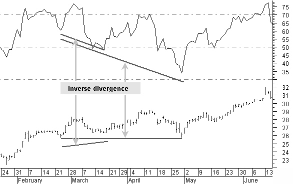
Figure 5.5: Inverse divergence with lower RSI bottom and a higher or equal price bottom.
Figure 5.5 shows an inverse divergence with a lower RSI bottom and a higher or equal price bottom. It is more common in an uptrend when temporary downward corrections end with a higher price bottom while having a lower bottom in the RSI.
This is a signal that the price is reversing and will continue the previous uptrend.
Stocks Technical Analysis Indicators
RSI (Continued)
Reference Level
The 30-70 fixed reference level used in the standard RSI is a disadvantage if you are using time periods other than the standard 14 bars.

Figure 5.6: Using an RSI 30 bars average, 30 and 70 levels are not reached anymore.
If you used a 30-bar reference, as shown in figure 5.6, you would notice that the 30-70 levels are not reached anymore.
We can solve this by using a variable reference level.

Figure 5.7: RSI with a standard deviation reference level.
In figure 5.7, you see a simple way of achieving this by using a standard-deviation value referenced to the RSI 50 level in a predefined look-back period.

We set the upper standard deviation to a value of 50 plus 1.5 times the standard deviation over a 100-day look-back period.
This is demonstrated in figure 5.8 with a 5-bar RSI.
For bigger RSI time periods, the reference level moves closer to the 50 level, whereas for smaller periods, like our 5-day RSI example, reference levels move farther away to the 20 and 80 levels.
Figure 5.8: Lower and upper reference set to 1.5 standard deviations for a 5 period RSI.
M- and W-shaped Patterns
M- and W-shaped patterns are short time patterns visible in the overbought or oversold areas of the RSI indicator.

Figure 5.9: M-shaped top and W-shaped bottom patterns are short term reversal signals.
Figure 5.9 shows small M-shaped patterns at the top and small W-shaped patterns at the bottom that give reliable short-term price reversal signals. Preferably, they’ll incline in the direction of the reversal.
The second leg of the M-shaped pattern does not move above the first leg. The second leg of the W-shaped pattern does not move below the first leg. M and W patterns are unrelated to convergences or divergences between the price and RSI indicator. They are more useful when there is convergence because they are, at that moment in time, the only visible indicators of, at least, a short-term reversal.
Stocks Technical Analysis Indicators
Bollinger %b Oscillator
Bollinger Bands were created by John Bollinger and are described in his book “Bollinger on Bollinger Bands”.

Figure 5.13: Bollinger Bands consist of three curves drawn in relation to price data.
The Bollinger Bands in figure 5.13 consist of a set of three curves drawn in relation to price data. The middle band usually is a simple 20-bar moving average, which serves as the base for the upper and lower bands.
Middle Bollinger Band = 20-period simple moving average
Upper Bollinger Band = Middle Bollinger Band + 2 * 20-period standard deviation
Lower Bollinger Band = Middle Bollinger Band - 2 * 20-period standard deviation
Upper Bollinger Band = Middle Bollinger Band + 2 * 20-period standard deviation
Lower Bollinger Band = Middle Bollinger Band - 2 * 20-period standard deviation
The use of standard-deviation bands is a method to measure price volatility.
With trending prices, the bands will be wider as a result of the higher volatility in price, whereas consolidation-period bands will be narrower as a result of smaller price moves.
I am not using Bollinger bands; instead, I use %b, a measure of where the last price is in relation to the bands.
Bandwidth is used for volatility-based trading opportunities; %b is strongly influenced by volatility, and we use it as an oscillator to show overbought and oversold situations, preferably looking at divergences.
Bandwidth is used for volatility-based trading opportunities; %b is strongly influenced by volatility, and we use it as an oscillator to show overbought and oversold situations, preferably looking at divergences.
We do not get the best %b indicator by using closing prices, but by using heikin-ashi average closing prices. We also are not using a simple moving average, but a weighted moving average for a faster short-term response.

leading indicator.
As you can see in figure 5.14, the indicator is leading most of the time, showing high levels, low levels, and divergences prior to turning points in price movement.
It is a fast and useful indicator used in combination with the other indicators.

ATR (Average True Range) trailing stop
Once a buying order is executed, you must always limit the risk by keeping an initial stop. The initial stop itself is variable from trade to trade because it will be based on different technical analysis techniques.
On the other hand, you must use a trailing stop as the ultimate selling signal to avoid losing too much profit.
ATR was developed by J. Welles Wilder and introduced in his book, “New concepts in technical trading systems” (1978). The Average True Range (ATR) indicator measures a security's volatility.
Wilder started the true range concept defined as the greatest value of:
- The current High less the current Low.
- The absolute value of the current High less the previous Close.
- The absolute value of the current Low less the previous Close.
If you need to calculate it yourself, it can be created as follows:
With this formula you could create an ATR value based on something else than the closing price, an average price for example.
To create a trailing stop based on the ATR value, we calculate the maximum allowed loss based on the ATR value multiplied by a factor.
InpMonth:=Input("Month",1,12,1);
InpDay:=Input("Day",1,31,1);
InpDay:=Input("Day",1,31,1);
We reach the entry point in the daily price data series when the required starting date corresponds with a date displayed in the chart. Please make sure the requested date does exist in the chart, otherwise nothing will be displayed.

Figure 8.15: Trailing stop nicely captures a five wave Elliott up move.
The trailing stop is broken when the closing price falls below the trailing stop line.


Andrews Pitchfork
Alan Hall Andrews is known in technical analysis for creating a method known today the “Andrews pitchfork”.
Action-reaction
Andrews describes his application as the median line method. The application of the median line method came from the ideas of Sir Isaac Newton and Roger Babson, including, among other things Newton’s first law: “For each action, there is an equal reaction.”
The Median Line
Construction

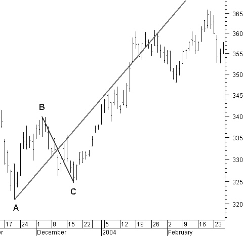
Figure 9.9: Construction of the median line.
1. Calculate the midpoint of the reaction B-C (the line B-C is normally not drawn).
2. From a previous reference, high or low point, draw a line through this midpoint. This is the median line.
2. From a previous reference, high or low point, draw a line through this midpoint. This is the median line.
Trading Based on the Median Line

Figure 9.10: Price returning to the median line 80% of the time.
1. The price will return to the median line about 80% of the time (figure 9.10).

Figure 9.11: Median line showing support and resistance.
2. The median line is a resistance and support line. The price will react around the median line (figure 9.11).
3. The price returning to the median line often will move for some time around that median line before a new direction is chosen (figure 9.11).

Figure 9.12: Price not touching the median line will push price in opposite direction.
4. If the price does not complete touching the median line, it will move in the opposite direction, past the price turning point used for the construction of the median line (figure 9.12).
The Pitchfork
After calculating and drawing the median line, Andrews added two additional lines parallel to the median line, from the points B and C.
This created parallel lines above and below the median line.

Figure 9.13: Andrews pitchfork channel.
These three lines are called the Andrews pitchfork (figure 9.13). Prices tend to move for some time within this pitchfork channel, similar to a trend channel.
Like in a trend channel, prices find support and resistance at the lower and upper side of the pitchfork channel.
Warning Lines
Andrews then added parallel lines in the past and the future at the same distance as the parallel lines from the median line; he called these warning lines.

Figure 9.14: Pitchfork warning lines.
In figure 9.14, you will notice that the price will move regularly to and within the boundaries of these warning lines.
I use the Andrews pitchfork mainly as a price target tool to see if price is reaching the median line (80% of the time). If price does not reach the median line we know to what level it will move next as a minimum. Additionally the outer lines of the pitchfork are quite effective as a trend channel giving us upper and lower boundaries for future price moves.
Action and Reaction Lines
Action-reaction Method 1
The action-reaction method 1 uses three lines: the reference line, the action line, and the reaction line.

Figure 9.15: Action-reaction method 1.
Look at figure 9.15 for an application using the action-reaction method 1. The reference line can be a median line, a trend line, a center line, or a multi-reversal line.
For every action, there is a reaction.
The action is the left side of the chart, or the past; the right side of the chart is the reaction into the future. Action lines are drawn under the same angle as the reference line, through a past pivot point.
The reaction is the future on the right side of the chart.
Reaction lines are drawn under the same angle as the reference line and at the same distance as the corresponding action lines.
Action-reaction Method 2
The action-reaction method 2 uses the same three lines as the action-reaction method 1: the reference line, the action line, and the reaction line.

Figure 9.16: Action-reaction method 2.
Look at figure 9.16 for an application of the action-reaction method 2. The reference line can be a median line, a trend line, a center line, or a multi-reversal line.
Only one action line, a parallel line with the reference line, is drawn through a pivot point in the past.
Reaction lines are drawn parallel to the reference line and at equal distances from each other using the distance between the action line and the reference line as the basic measure.
I mainly use the action-reaction methods to find crossings with other price projection techniques to get an indication on the time axis when a target could be reached.